Timberland—Real Man Kenneth Shinabery

Illustration Meets Product…
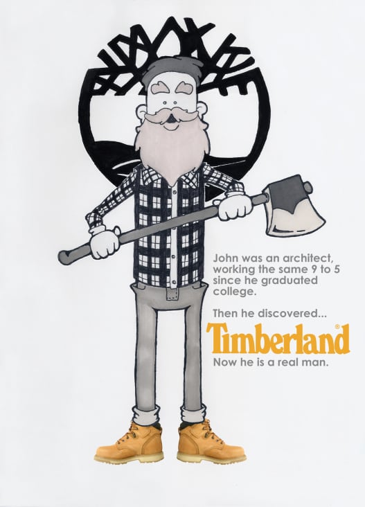
The idea of this spec campaign was to create a possible print ad that could be used in magazines or as posters. Utilizing a gray scale illustration versus a human, draws more emphasis to the show and to the brand. While the illustration does create a humorous feel the viewer’s eyes are directed to the boots and the Timberland logo.
The iconic Timberland logo was set behind the character “John”, as if to establish the idea that he has grown into a real man, in comparison to the logo’s tree taken on a new life or lifestyle. Many logos today, such as the Timberland logo, are highly recognizable thus the viewer will still view the logo as the Timberland logo even if it is set behind the character of John.
Taking the concept further…
With any idea one can expand upon it. The concept behind the print ad / poster can easily be turned in to a commercial. However, this time using actual people.
Kenneth Shinabery