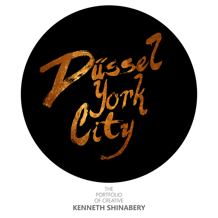
Düssel York City Logo Kenneth Shinabery


When I started working on my Adobe Portfolio site I thought now would be the right time to brand myself and my work. My following has grown via Social Media, so when creating a new site to showcase my portfolio it made sense to create a logo for myself.
The Concept
I am a New Yorker that is currently living in Europe, thus I wanted to create a brand identity for myself that reflects my experience. Having lived in NYC for a majority of my life, it is a place that I will always hold dear. When I moved to Germany in 2012, I began exploring the European experience. Taking in the sites, culture, sounds, tastes, images, textures and life. This has become apparent in some of the artwork that I create.
Because I am able to combine the New York style with European trends the idea of a global experience has become relevant in my life. This is how the concept of Düssel York City was formed. Even if I do not stay in Düsseldorf this global outlook will follow me in my journey.
The Creation
I am a creative that is multidiscplinary and wanted a logo that was created utilizing more than one medium.
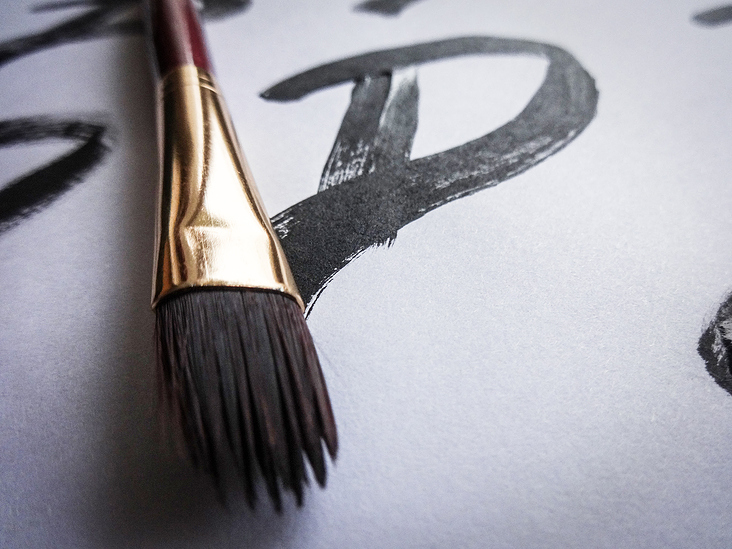
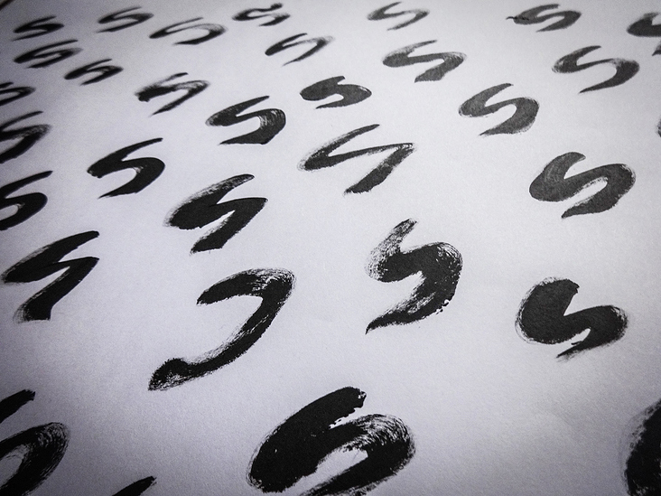
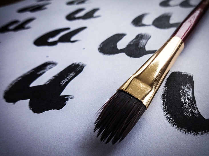
Because I have a traditional art background, I decided that I wanted to create the letters by painting them. I then painted several versions of each letter. Since I also have a background in photography, I thought it would be better to photograph the letters as opposed to scanning them.
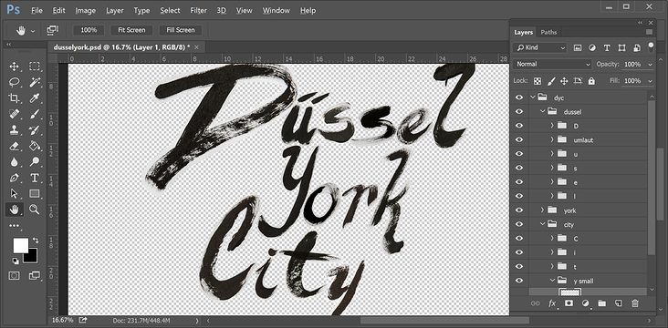
As a Creative Director and Art Director, I know it is important to make the right decisions during the creative process… so I chose the letters that worked the best together. Using Adobe Photoshop and my Wacom Cintiq Companion, I put my layout and design skills into play and placed the individuals letters in a way that worked perfectly.
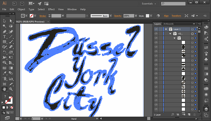
In my next step I took the final layout into Adobe Illustrator and did a Live Trace of the words, thus creating a vector graphic that could be resized. Back in Adobe Photoshop I chose three textures that could be utilized in different ways. I also ran tests to see what the logo would like in small/large scale and in black & white. Having seen that the finalized look could be versatile I signed off on the final design.
In addition, I added text that would appear below the logo when used on my portfolio. As a designer I know that sometimes additional text does not work when shrinking a logo. So this text will only appear in certain places that the logo is used. Also I have decided that I can can change the text below the logo if need be. For this reason, I used a very simple font that would not overpower the logo itself.
Kenneth Shinabery
Kenneth Shinabery
Kenneth Shinabery
Kenneth Shinabery
Kenneth Shinabery
Kenneth Shinabery